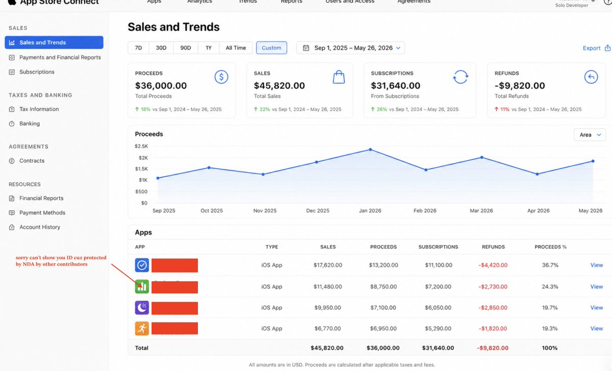
I Built 40 Apps With Claude Code and Now Make $36,000/Month. (Exact playbook)

No coding degree. No team. No VC funding. Just Claude Code, a keyword research tool, and a repeatable system I run from my laptop.
Before we start: the fact-check (and there's one secret ingredient - keep reading)
Let me be straight with you. I've seen too many "make money with AI" guides that promise the moon and deliver a PDF. This is not that.
Here's what's actually true:
The market is real and growing fast. The App Store generated $152 billion in 2026. iOS users spend 2.1x more money than Android users. Apps rated 4.5+ are 2.1x more likely to rank in the top 50. This is not a dying market - it's the opposite. AI tools just opened the door to people who previously couldn't walk through it.
The money is real - but it's a portfolio game. My $36,000/month doesn't come from one app. It comes from 40 apps across different niches, each making $500–$3,000/month, compounding every month. The first app teaches you the system. By app 10, the system runs itself.
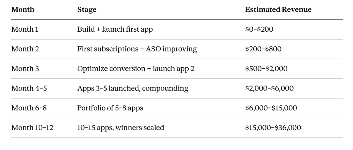
The timeline is honest. First payments: month 1–2. Consistent $1,000+/month: month 3–4 if you nail the niche. $36K/month range: month 10–12 if you scale what works and kill what doesn't.
One more thing nobody tells you: 75% of all App Store downloads start with a search. Which means there's a version of this where your app gets discovered every single day without you doing anything - just because you put the right keyword in the right place.
And yes - there's a secret ingredient that makes everything in this guide 10x faster. It's not a tool. It's not a prompt. Stick around. It's in Step 3.
Disclaimer: Results depend on your niche, consistency, and willingness to iterate. This is a real system-— not a magic button.
Who this is for
This system works if you:
Have 2–4 hours per day to learn and iterate
Are comfortable following step-by-step instructions
Don't have a coding background (Claude handles 90% of the code)
Want to build real income - not a side hustle, a business
This is not for you if you expect results in week one. The first app teaches you the system. The second improves it. By app 3/5, you start seeing compounding results.
What you'll need (and what it costs)
The good news: you can test your first hypothesis for basically nothing.
Before you pay for anything, you can build and run your app on your own device using the iOS simulator or Android emulator — completely free. No Apple Developer Account needed until you're ready to ship to the App Store. You can share a working beta with friends via TestFlight for free. Validate first. Spend later.
Starter setup (testing your hypothesis) ~$20/month:
Real-world cost in month 1–2: ~$50–100/month. Start lean. Validate. Then invest in distribution.
One underrated free tool: Reddit.
Before building anything, search Reddit for your niche keyword. Try these searches:
"r/[yourniche] best app for..."
"r/[yourniche] is there an app that..."
"[niche keyword] app recommendation site:reddit.com"
If people are asking for something and nobody has a satisfying answer - that is your app idea. Reddit is a real-time signal of what people actually want and can't find. It's free, it's honest, and it's better than any market research tool.
The biggest mistake beginners make: spending $200 on tools before validating the idea. Start with $20 and a Reddit search.
The secret nobody talks about
Before the system, the mindset:
Building apps is now the easy part. Finding the right problem is the hard part.
Five years ago, you needed a developer, a designer, a product manager, and a backend engineer to ship a decent iOS app. Now Claude Code does 90% of that work in minutes.
This means the competitive advantage has completely shifted. Everyone can build. The winners are the ones who:
Find underserved keywords with real search volume
Build something that solves the problem cleanly
Ship fast and iterate based on real user data
Multiply winners across niches
That's the system. Let me show you how it works.
STEP 1 - Find your $10,000/month idea with one keyword
This is where most people skip and fail. They build something they think is cool. I build something people are already searching for.
The principle: 75% of App Store downloads start with a search. The keyword IS the problem. If someone searches for exemple "stamp identifier," they have a specific pain - they want to know if their old stamps are valuable. Build the solution to that exact pain.
How to find your keyword:
Open your ASO tool of choice (AppTweak, Astro, ASOdesk - any works)
Think of a broad category: identifier apps, tracker apps, scanner apps, calculator apps
Type in a keyword and look at two numbers: Popularity and Difficulty
You want: Popularity 40–70 + Difficulty under 60 — high enough to have real traffic, low enough to win
The filter I use:
Open top competitor in your niche
Pull all their keywords
Filter: popularity high, difficulty under 60
Filter by your topic keyword (e.g. "stamp")
Look for keywords where fewer than 4 apps have 100+ ratings
Check release dates — if most apps are from 2024–2025, the niche is fresh
What you're looking for: A keyword where there's clear demand, the existing apps are mediocre, and release dates show the niche is still early.
Insight: The best niches in 2026 are "AI identifier" apps. People want to point their camera at something and get an instant answer — stamps, coins, plants, insects, rocks, wine labels, antiques. The pattern is identical across all of them. Once you build one, you've built the template for all the others. Change the keyword, change the AI prompt, change the icon. Ship in 3 days.
Prompt to use:
STEP 2 - Validate before you build (the step that saves you months)
The biggest waste of time: building an app nobody pays for.
The fastest validation method: fake door test.
Before writing a single line of code, create a simple landing page that describes your app and has a "Pre-register" or "Get Early Access" button. Drive 50–100 people to it through TikTok, Reddit, or Facebook groups in your niche.
If 5–10% click the button and leave their email: build the app. If nobody clicks: change the niche.
Tools for landing page validation (2026):
Lovable.dev — describe what you want in plain English, it builds a full landing page with React. Best for pages that need a polished design fast. Free tier available.
Bolt.new — similar to Lovable, slightly more developer-friendly. Great for landing pages that need a form, database, or basic logic baked in.
Replit — run your landing page (or even a working web prototype) in the browser without installing anything. Perfect if you want to share a clickable demo, not just a static page. Free tier is generous.
Antigravity — Claude's own agentic browser tool. Use it to research competitor landing pages, extract what messaging works, and brief Lovable or Bolt with real competitive intelligence before you build.
Carrd.co — fastest static landing page, no code, $9/year. Use this if you just need an email capture page in 20 minutes.
Insider tip: Don't build a beautiful landing page for validation. Build the ugliest page that communicates the value clearly. I've seen ugly Carrd pages with 15% email conversion beat beautiful Lovable pages with 2% because the copy was sharper. Validate the message, not the design.
Prompt for validation landing page:
Where to drive traffic for validation:
Reddit communities in your niche (r/philately for stamp collectors, r/coins for coin collectors, etc.)
TikTok 30-second video: "I'm building an app that does X — would you use this?"
Facebook groups related to your niche
Twitter/X with relevant hashtags
Note: If your validation fails twice in a row - the problem isn't you, it's the niche. Move on without emotion. I've killed 12 ideas before finding the ones that work. Speed of learning beats persistence on wrong ideas.
Insight: The fastest validation method I've found costs $0. Post in the relevant subreddit: "I'm building an app that does X — would you pay $2.99/month for this?" If you get 10+ upvotes and comments saying "yes please," build it. If silence — move on. Reddit users are brutally honest and they represent real demand.
STEP 3 - Set up your boilerplate (build once, reuse forever)
This is the secret that separates someone who builds one app from someone who builds 40.
Every iOS app has the same scaffolding:
Onboarding flow (3–5 screens)
Paywall / subscription screen
Settings screen
Core feature screen
Review prompt (triggered at the right moment)
Instead of rebuilding this every time, I built one boilerplate that I copy for every new app. This alone saves 8–12 hours per app.
How to build your boilerplate:
Open Xcode and create a new iOS project
Open Claude Code
Use this prompt:
Boilerplate setup prompt:
The secret ingredient (told you it was here): The boilerplate IS the secret ingredient. Every developer who builds one app spends 12 hours on onboarding and paywall. I spent 12 hours once and now spend 0 hours on it for every new app. After 10 apps, I've saved 120 hours - that's 3 full work weeks. The developer who ships 10 apps in the time you ship 2 isn't smarter. They have a boilerplate.
Step 4 — Build the core feature with Claude Code
Now you add the one thing that makes your app worth downloading. Everything else is packaging. The core feature is why someone pays.
How I build:
Open Claude Code in the project folder
Describe exactly what the core screen needs to do
Claude builds it, I run it, I iterate
Core feature prompt (adapt to your app):
What to do when Claude's first output isn't perfect:
Don't give up. Give feedback. The more specific, the better.
Bad feedback: "This doesn't look good" Good feedback: "The result card is too small - make it take 80% of the screen height. The font for the title should be 24pt bold. Add a share button in the top right corner."


Step 5 — Design that converts (this is where money is made or lost)
The app icon and screenshots are your App Store billboard. Most indie developers spend 90% of time on code and 10% on design. That ratio should be reversed.
Data that matters:
Apps with professional icons convert 15% higher in the App Store
Apps with App Preview videos get 23% more installs
A/B testing your icon can improve conversion by 15%
My design process:
Step 5a: Pick your accent color
Pick one color. Use it everywhere: icon background, paywall CTA button, app accent.
Step 5b: Design the icon in Figma
Open Figma
Create 1024x1024px canvas (App Store requirement)
Find a simple icon that represents the core function (FlatIcon, Noun Project)
Ask Claude or Gemini: "Take this icon description and suggest how to combine it with a magnifying glass / lightning bolt / checkmark to make it feel like an AI identifier app"
Keep it simple: one symbol + your accent color background
Export as PNG
Design secret nobody tells you: The best app icons are ones you can describe in 5 words. If you need 15 words to describe your icon, simplify.
2026 insight: Use Antigravity to research your competitors' App Store pages automatically. Ask it to visit the top 5 competitor apps, screenshot their icons and first 3 screenshots, and summarize what visual patterns they share. This takes 10 minutes instead of 2 hours of manual research.
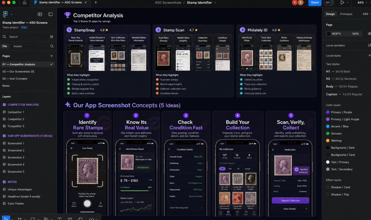
Step 5c: Screenshot strategy
Go to your ASO tool
Find the top 3 competitors by ratings
Screenshot their App Store screenshots — not to copy, but to understand what value they lead with
Ask Claude:


Step 6 — ASO metadata (the difference between 10 downloads and 1,000)
This is the most underrated part of the whole system. The App Store algorithm works exactly like Google SEO. Put the right keywords in the right places and traffic comes to you for free forever.
The three places that matter most:
App Name (30 characters): Include your #1 keyword exactly. Example: "Stamp Identifier: Scan & Value"
Subtitle (30 characters): Include your #2 keyword. Example: "Find Rare Stamps & Collections"
Keyword field (100 characters): Stuff with relevant keywords, no spaces, comma-separated, no duplicates from name/subtitle
Rules:
Never repeat a keyword that's already in the name or subtitle
Fill all 100 characters in the keyword field
Use keywords that describe what users are searching, not what you call features
Prompt for App Store description:
Insight most devs miss: Update your keyword field every 60–90 days. The App Store algorithm re-indexes your app regularly. If a keyword isn't driving downloads after 60 days, swap it for something else. ASO is not a one-time setup — it's an ongoing experiment. The top apps update their metadata quarterly. 79% of top-ranked apps do exactly this.

Step 7 — Ship it and start collecting data
Once your app passes Apple Review (typically 24–48 hours in 2026), your job changes from builder to analyst.
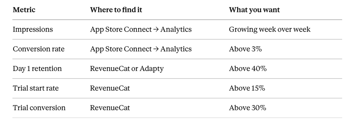
Week 1 after launch: what to track
If conversion is below 3%: Your screenshots or icon aren't compelling. Run an A/B test on the icon.
If trial conversion is below 30%: Your paywall timing or pricing is wrong. Move the paywall trigger later. Try a longer free trial.
If day 1 retention is below 40%: Your onboarding doesn't communicate value fast enough. Show the result in the first 30 seconds.


Step 8 — Scale what works (how $36K/month actually happens)
One app making $1,000/month is a side hustle. Ten apps making $1,000–5,000/month is a business.
The scaling system:
When an app hits $500/month consistently, I build the next one in the same category or an adjacent one. The boilerplate stays the same. I change the keyword, the core feature, and the icon.
Real timeline for positive scenario:
The compound insight: The first app you ship is your worst app. The tenth is your best. Most people quit after app 2 because they expected app 1 to pay rent. The math only works when you have 5–10 apps running. Think of each app as buying a lottery ticket — except these lottery tickets never expire and pay out every month forever.
This is the positive scenario. It assumes:
You ship one app per 2–3 weeks
You iterate based on data, not ego
You kill apps that don't work after 60 days
You double down on apps that gain traction
Secrets and traps nobody talks about
Secret 1: The review prompt timing is a superpower
Most developers show the review prompt on app open. That's wrong. Show it only after a successful result. "Your stamp is worth $45!" → then ask for review. Conversion goes from 2% to 15%+.
Secret 2: Lifetime pricing beats annual in single-use apps
If your app solves a problem people use once or twice (identify a stamp, translate a document, analyze a photo), offer a lifetime option at $9.99–$19.99. People hate ongoing subscriptions for one-time problems. Lifetime converts 3–4x better in these niches.
Secret 3: The zombie app opportunity
Search ASO tools for apps with 500–5,000 ratings, high popularity keyword, but last update was 2022–2023. The developer abandoned it but demand is still there. Build a better version, target their keyword. You'll steal their traffic within 60 days.
Secret 4: Keyword stuffing in the keyword field is legal (and powerful)
Apple's keyword field is 100 characters. Use every single one. Include plural forms, synonyms, misspellings. Example for Stamp Identifier: "stamps,postal,philately,collector,rare,vintage,value,scan,identify,antique,postage"
Secret 5: The launch week hack
Apple's algorithm gives new apps a temporary boost in their first 7–14 days. To maximize this window, ask every person you know to download, use the core feature, and leave a 5-star review in the first 72 hours after launch. 10 reviews in 72 hours signals quality to the algorithm.
Secret 6: Web SaaS runs on the same system
If you want to build web products instead of mobile apps, the system is identical — but use Lovable.dev or Bolt.new instead of Xcode + Claude Code. Target Google search keywords instead of App Store keywords. Use Stripe for payments instead of StoreKit. Web SaaS typically has lower volume but higher ARPU ($20–50/month per user vs $5–10 for mobile).
What doesn't work (learn from my mistakes)
❌ Building in a niche you love but nobody searches for Your passion is irrelevant. The keyword volume is the only signal that matters.
❌ Shipping once and waiting The App Store algorithm rewards apps that get consistent new reviews. If you stop updating, you start dying.
❌ Copying a top-10 app in a popular category You cannot beat apps with 100,000+ ratings on their own keyword. Find niches where the leader has under 5,000 ratings.
❌ Perfect design before validation I see this constantly. Developers spend 3 weeks on icon A/B tests before they have a single paying user. Ship ugly, validate, then invest in design.
❌ One app strategy One app can make $1,000/month. It rarely makes $10,000. The portfolio is the business model.
Tool stack for 2026 (beyond the basics)
For building:
Claude Code — primary builder, best for complex logic
Cursor — alternative IDE with AI, better for large codebases
Lovable.dev / Bolt.new — for web SaaS versions, zero-code frontend
For keyword research:
AppTweak — most detailed, best for professional ASO
ASOdesk — good free tier, solid for beginners
Astro — what I use personally, clean interface
For analytics:
RevenueCat — subscription analytics, free up to $10K MRR
Adapty — alternative to RevenueCat, strong A/B testing
App Store Connect — built-in, free, essential
For design:
Figma — industry standard, free starter
Canva — faster for app icons and screenshots if you're not design-focused
Gemini image generation — icon ideas and variations
For marketing:
TikTok — best organic reach for app demos in 2026
Reddit — targeted niche communities, free
X (Twitter) — builder communities, good for early adopters
What changes when you finish reading this
Before: You have an idea but no system. After: You have a repeatable process that can produce a validated, launched mobile app in 5–7 days.
Your next steps right now:
Open an ASO tool — go to AppTweak or ASOdesk free trial
Pick a broad category you find interesting (not necessarily know — just interesting)
Run the keyword research from Step 1
Find one keyword that passes the filter: Popularity 40–70, Difficulty under 60, fewer than 4 competitors with 100+ ratings
Build the validation landing page with Lovable.dev or similar service
Drive 50 people to it
Do not download Xcode yet. Do not open Claude Code yet. Do the validation first.
If 5 people leave their email, you have a business. If nobody clicks, you saved yourself 2 weeks.
One honest thing
$36,000/month is real. I built it one app at a time, one rejection at a time, one abandoned keyword at a time.
The system works. But the system requires you to ship when you don't feel ready, iterate when you want to quit, and keep going past the first three apps that barely make $50/month.
The people who hit $36K/month are not smarter. They are more systematic and more willing to be wrong fast.
That's the whole secret.
Tools mentioned: Claude Pro ($20/mo) · AppTweak ($20–100/mo) · Figma (free) · Apple Developer Account ($99/year) · RevenueCat (free to $10K MRR) · Lovable.dev (free tier available)
All data verified May 2026. App Store revenue figures from App Store Connect, CloneChart, SQ Magazine, and RevenueCat/Adapty industry reports.
Please bookmark, RT and follow @thegreatest_sv for more alpha, AI tools and quality research.
DISCLAIMER (Earnings & Info) Earnings or statistics shown in this article are examples from my research, own experience and are not guarantees of what you’ll earn. Results differ based on niche, content quality, RPM/CPM, audience engagement, consistency, effort, and other factors. This is not financial, tax, legal, or professional advice-consult the appropriate experts before making business decisions.

Prompts
I'm researching app ideas in the [category] space for iOS.

I found this keyword: [keyword]
Current competitor apps: [list 2-3 with their ratings and release dates]

Based on this data, answer:
1. Is this a real user problem or a curiosity?
2. What would the ideal version of this app do that competitors don't?
3. What subscription price would feel fair for this type of app ($2.99/week, $9.99/month, $19.99/year)?
4. What would make someone open this app 3x per week?
5. What's the single biggest reason someone would pay instead of using a free alternative?
My app is called [App Name]. It helps [target user] do [specific thing].

Suggest 5 accent color options for this app.
For each: hex code, why it fits the app psychology, and one competitor in a different category that uses this color successfully.
Format as a simple list.
Build me a complete iOS app boilerplate in Swift with the following:

ONBOARDING:
- 3-screen onboarding flow with illustration placeholder, headline, and subtitle on each screen
- "Continue" button on each screen, "Skip" option on screen 1
- Data stored in UserDefaults: hasCompletedOnboarding

PAYWALL:
- Full-screen paywall shown after onboarding completion
- 4 subscription options: Weekly ($2.99), Monthly ($9.99), Annual ($49.99, shown as "Best Value"), Lifetime ($79.99 one-time)
- Free trial toggle on Weekly option
- "Continue" CTA button + "Restore Purchases" link + "Privacy Policy" / "Terms" links
- Use StoreKit 2 for subscription handling
- Pro badge shown in app header after purchase

SETTINGS SCREEN:
- Restore Purchases button
- Privacy Policy link
- Terms of Service link
- Rate App button (opens App Store review)
- App version display

REVIEW PROMPT:
- Trigger SKStoreReviewController ONLY after a successful core feature use (not on launch, not after failure)
- Maximum once per 30 days

ARCHITECTURE:
- SwiftUI throughout
- MVVM pattern
- Navigation using NavigationStack

Make sure everything compiles and runs on iOS 17+.
Build me a simple mobile app landing page for an app called [App Name].

What it does: [one sentence description]
Target user: [who they are and their pain]
Main benefit: [what they get]

Page should include:
- Headline that describes the problem, not the solution
- 3 bullet points of key features
- One email capture form with "Get Early Access" CTA
- App Store/Google Play badge placeholders
- Clean, minimal design — white background, one accent color

No lorem ipsum. Write real copy.
Add the core feature screen to this existing iOS app.

FEATURE: [Describe your feature in one sentence]

SCREENS NEEDED:
1. Main screen: [describe what the user sees]
2. Input method: [camera / text / photo library / manual input]
3. Processing: [what happens when user submits]
4. Result screen: [what gets shown after processing]
5. History screen: shows past uses in reverse chronological order
6. Collection/Saved screen: user can save favorite results

API INTEGRATION:
- Connect to [OpenAI/Gemini] API using key stored in Info.plist as AI_API_KEY
- Prompt to send: "[Your exact AI prompt here]"
- Parse response and display: [fields you want shown]

UX DETAILS:
- Show loading state while API call is in progress
- Show error state with retry button if API fails
- Ask for App Store review ONLY after a successful result (not on error)
- Haptic feedback on successful result

Make sure all screens are connected in the main tab bar alongside the existing Settings tab.
Everything should compile and run on iOS 17+.
I'm designing App Store screenshots for [App Name].

Here's what the top 3 competitors highlight in their screenshots:
- Competitor 1: [what they show]
- Competitor 2: [what they show]
- Competitor 3: [what they show]

My app's unique advantages are: [list 3 things you do better]

Write 5 screenshot headlines (under 6 words each) that highlight my advantages.
Make them benefit-focused, not feature-focused.
Example of bad: "Powered by AI Technology"
Example of good: "Find Out What It's Worth"
Write an App Store description for [App Name].

What it does: [one sentence]
Target user: [who they are]
Top 3 features: [list them]
Keywords to include naturally: [your keyword list]

Requirements:
- First paragraph must hook immediately — no "Welcome to [App Name]"
- Include keywords naturally, not as a list
- End with a clear call to action
- Under 4,000 characters
- Do NOT use emojis excessively
- Do NOT write AI slop — write like a real person describing a useful tool
Links
Related articles

The App Made $4,000 Because It Replaced One Ugly Spreadsheet.I Made My Own App with Claude Code.
It charged 40 users $99/month by saving each of them 3+ hours a week.

How to find an app idea that already has people waiting to pay for it (with a $100K/month example)
Most people find app ideas backwards.

How I'd make $10 million with AI agents
Two markets worth trillions are opening at the same time. I've been through 3 platform shifts living in Silicon Valley building/selling VC-backed companies and I've NEVER seen this.