How a single slideshow format turned a $40k campaign into 80M+ views

This format is performing over everything right now:
We ran a campaign recently. $40k budget. $1.75 CPM.
Expected outcome based on standard metrics: around 22 million views.
Actual result: 80 million views.
One post hit 8M+ views on its own.
This wasn't luck. This was a format.
A specific slideshow structure we've tested extensively and can confirm works for pretty much any app or product. Engagement rates were absurd - averaging 7-8% across the entire campaign when typical content sits at 1-2%.
This article breaks down the format, why it works, and how to replicate it.

The numbers in context
Let me put this in perspective.
A $40k campaign budget at $1.75 CPM should mathematically return around 22 million views. Standard expectation.
We hit 80 million.
Not a slight overperformance. Nearly 4x the expected output from the same budget.
The campaign generated:
- 62M+ cumulative views
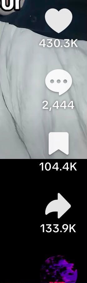
- 3.4M likes
- 21.9K comments
- 942.1K shares
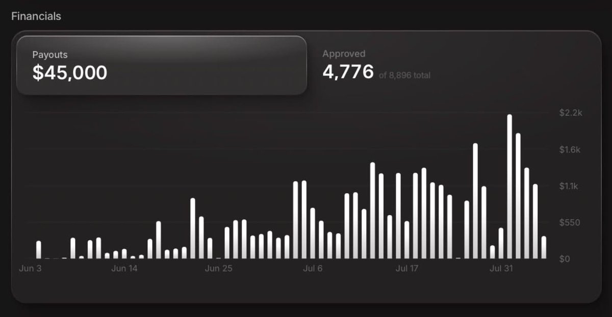
- $45,000 in creator payouts
- 4,776 approved video submissions
The engagement ratio was unlike anything we'd seen on previous campaigns. 7-8% engagement rates on slideshow content
These are numbers you usually only see on massive viral moments, not sustained campaign performance
The format that changed everything
The highest performing content across this campaign followed a specific structure. Once we identified it, we started seeing it everywhere - and understanding why it works so well.
The format: Authority-based list content delivered through slideshows
Let me break down what that actually means.
Anatomy of a viral slideshow
Slide 1: The hook
This determines 80% of whether the content performs or dies.
The hook structure that worked:
“[Authority figure] [impressive credential]. These are the [number] [rules/tips/things] [specific outcome].”
Real example from the campaign:
“My dad worked homicide for 30 years. These are the rules he made every girl in our family memorize.”
Breaking down why this hits:
Authority figure - “My dad” creates personal connection. Not some random expert. Family.
Impressive credential - “worked homicide for 30 years” establishes serious credibility. This person has seen things. They know what they're talking about.
Specific audience - “every girl in our family” makes it clear who this is for. Women immediately self-identify. Men think of women they care about.
Implied stakes - The word “homicide” implies danger. Not casual tips. Rules that could save your life.
Curiosity gap - “These are the rules” makes you NEED to know what they are. The loop is open. You have to keep watching to close it.
All of this in the first slide. Under 3 seconds of reading time.

Slides 2-6: The value delivery
The middle slides are straightforward. Deliver on the promise of the hook.
Five rules. Five tips. Five things. Whatever the number is.
Each slide is one item on the list, clearly stated.
Key: the content has to actually be valuable. You can't bait people with an incredible hook and then deliver generic garbage. They'll drop off and the algorithm notices.
The rules/tips should be:
- Specific (not vague advice)
- Actionable (something they can actually do)
- Memorable (easy to recall later)
- Slightly surprising (at least one or two things they haven't heard before)
The homicide detective example works because the safety rules are genuinely useful AND come from a credible source.

Slide 7 (optional): The soft CTA or additional value
This is where it gets interesting for app promotion.
The best performing content in this campaign did NOT put a hard CTA in the video itself.
There was often a light, natural mention of the app somewhere in the slides - never a hard sell - while the actual CTA lived in the caption, paired with a link in bio.
But why?
The moment you put “Download [App] now!” on a slide, the content loses its value-first feel and starts feeling like an ad.
People scroll past ads. They don't share ads. They don't comment on ads.
The content itself stays pure. Delivers value from start to finish. The viewer watches the whole thing, engages with it, shares it with friends.
Then in the caption: “If you want to stay safe, [App] has a one-tap emergency feature that [benefit]. Link in bio.”
The content does the heavy lifting of grabbing attention and building trust. The caption converts viewers who are genuinely interested.
This separation is crucial. It's why this format outperforms traditional UGC where the creator is clearly promoting something throughout the video.
Why this format ALWAYS works
The psychology behind it:
1. Authority creates instant trust
Random person giving advice = skepticism
Expert in a relevant field giving advice = attention
The “my dad was a homicide detective” framing immediately bypasses the viewer's natural skepticism. They're not being sold to. They're receiving wisdom from someone who knows.
This works for any niche:
- “My mom was an ER nurse for 25 years. These are the symptoms she said to never ignore.”
- “I worked as a hotel manager for 15 years. These are the things I'd never do as a guest.”
- “My uncle was a mechanic for 40 years. These are the used car red flags he taught me.”
The authority source doesn't have to be you. Can be a family member, mentor, or expert you interviewed. What matters is the credibility is real and relevant.
The engagement rate on this campaign was an astonishing 8%.

2. Lists are inherently bingeable
The brain loves lists.
“5 things” is a complete package. The viewer knows exactly what they're getting. They know there's an end point. They can mentally commit to consuming the whole thing.
Top 5/Top 10 content has worked since the beginning of the internet. Not a new trick. A fundamental truth about how people consume information.
Slideshows amplify this because each swipe is a micro-commitment. Swipe for #1, swipe for #2. Each swipe pulls them deeper.
3. The hook creates a loop that demands closure
When you hear “These are the rules he made every girl in our family memorize” - you NEED to know what the rules are.
The brain doesn't like open loops. It wants to close them.
Why cliffhangers work in TV shows. Why “You won't believe what happened next” works in headlines. Why this hook format works in slideshows.
The viewer can't scroll away without feeling like they're missing something. They have to see the rules before they can move on.
4. The content is genuinely shareable
The test for shareable content: Would someone send this to a friend without being asked to?
Safety tips from a homicide detective? Absolutely. People have mothers, sisters, daughters, girlfriends, friends who they'd want to see this.
Built-in share motivation that has nothing to do with the brand being promoted.
942,000 shares on this campaign. Almost a million people actively sending this content to others. Earned distribution no ad spend can buy.
Adapting this for any app
This format isn't limited to safety apps. We've seen it work across categories. The key is matching the authority angle to the product benefit.
Finance apps:
“My dad was a financial advisor for 30 years. These are the money rules he drilled into me since childhood.”
“I worked at a bank for 15 years. These are the account fees people don't realize they're paying.”
Productivity apps:
“I was an executive assistant to three CEOs. These are the scheduling habits they all had in common.”
“My manager ran a 500-person team. These are the organization systems she swore by.”
Fitness apps:
“I was a personal trainer for Olympic athletes for 20 years. These are the exercises people do completely wrong.”
“My doctor has been practicing sports medicine for 30 years. These are the recovery mistakes he sees constantly.”
Dating apps:
“I was a couples therapist for 25 years. These are the early dating green flags people miss.”
“My grandmother was married for 60 years. These are the relationship rules she gave me before she passed.”
The formula transfers. You need:
- A credible authority source (real or relatable)
- An impressive credential that builds trust
- A number of tips/rules/things that deliver value
- Content that genuinely helps the viewer
- A product that naturally connects to the value provided
Campaign structure
How we ran this at scale.
We didn't post one video and hope. We deployed this format across hundreds of creators simultaneously.
The brief:
Creators got the format structure and were told to adapt it to their own niche/angle. They came up with their own authority hooks, their own lists, their own spin.
Some worked. Some didn't. The ones that worked got scaled immediately.
The testing:
We'd see which specific hooks gained traction in the first few hours and feed that information back to other creators. “The homicide detective angle is popping - anyone with a law enforcement connection should try that angle.”
Real-time optimization meant we constantly improved hit rate throughout the campaign.
The CTA placement:
A light, natural mention of the product was fine on the slide itself - never a hard sell. The actual CTA lived in the caption, every time, paired with a link in bio. Non-negotiable.
The caption format that worked:
“[App name] actually has a feature that does [related thing]. Been using it for [timeframe] and it's [genuine benefit]. Link in bio if you want to check it out.”
Casual. Not pushy. Just information.
Why this matters for app marketing
Typical app marketing content looks like app marketing content.
That's the problem.
The viewer's brain has been trained to identify promotional content and scroll past it. Doesn't matter how good your app is if the content triggers that “this is an ad” response.
This format works differently.
The content looks like valuable advice from a credible source. Because that's what it is. The app is almost an afterthought - a helpful tool that relates to the value provided.
The viewer:
- Stops because the hook is compelling
- Watches because the content is valuable
- Engages because they want to save/share
- Checks the caption because they're already interested
- Downloads because the app genuinely connects to what they just learned
Compare that to:
- Sees ad
- Scrolls past

Results
$40k budget: 80M views (expected 22M)
$45,000 paid out to creators
4,776 approved submissions
7-8% average engagement rate
One post hitting 8M+ views
And a format we now know works and can deploy on future campaigns.
These are real numbers from a real campaign.
The format is proven. The structure is replicable. The results are documented.
How to start using this
If you're an app owner or running campaigns:
Drop me a DM. We'll set up a campaign for you, handle it end to end. Let creators adapt the authority angle to their own audiences. Keep CTAs in captions. Watch the data and scale what works.
If you're a creator:
Find campaigns that align with your niche. Develop your own authority hooks that feel authentic to your background or network. Focus on delivering genuine value in the list itself. Don't make it feel like an ad.
If you're running an agency or managing distribution:
This format should be in your playbook immediately. Test it across different app categories. Build a library of proven authority hooks. Systematize the testing and scaling process.
The content landscape keeps evolving. What worked last year doesn't work this year. What works this month might not work next quarter.
But right now, in this moment, this format is printing.
We've tested it. We've scaled it. We've seen the numbers.
Now you have the blueprint.
Related articles

How to Run AI Slideshows Profitably on TikTok
the algorithm re-serves a slideshow to people who scrolled past it.
We got 75M+ views in 6 months. This is how we run social with Muse, GrokBot now (Step by step tips)
Part of that is luck. Most of it is a content marketing system we built with [Helena](https://www.hirehelena.com), our favorite AI marketer.
DaVinci MCP + Astra + Skills - How to setup a local influencer factory
If you're reading this you've been chosen by the algorithm gods. Use this knowledge wisely.